
Summary
You’ve taken the perfect photo, spent hours editing it in Lightroom, and selected it for your first major exhibition. You’re proud of the image on your screen. But the digital file on your calibrated EIZO is not yet a piece of art on the wall. The step from “pixel to pigment” (the physical materialization) is where many photographers and artists falter. Incorrect paper choice, unexpected blurriness from enlargement, a flat print, or a print that discolors in the sun after 2 years. It can make or break your reputation. In this guide, based on our experience at Europlan with professional photographers and museums, we take you through the technical and creative process of making museum-grade prints with your large-format printer, such as the HP DesignJet (e.g., the Z9 dr) Z9+.
Step 1: Preparation (Resolution & Format)
A photo that looks good on Instagram (1080px wide) is absolutely unusable for an exhibition print. A print of 60 x 90 cm in a gallery requires data.
The Rule of DPI (Dots Per Inch)
- For magazines (Viewing distance 30cm): One prints at 300 DPI. This is the standard.
- For large format (Viewing distance 1-2 meters): Different rules apply here. No one looks at an A0 poster with a magnifying glass. Often 150-200 DPI is already sufficient. Staring at 300 DPI for a 2-meter wide print makes your file unnecessarily heavy and slows down ripping, without visible quality difference.
- Upscaling: Do you have an old photo, a crop, or an image from a lower-resolution camera? Use modern AI upscalers (such as Photoshop’s “Super Resolution” or Topaz Gigapixel) before you send it to the printer. The software cleverly ‘invents’ extra pixels. A Z9+ is mercilessly sharp and will show every pixelation and every JPG artifact if you don’t do this. Clean your file.
Sharpening (Output Sharpening)
Sharpening for a screen is different than for a print.
- On paper, ink always spreads a little bit (dot gain).
- Sharpen your image specifically for “Output”. In Lightroom, export with “Sharpen for: Matte Paper” or “Glossy Paper”.
- Matte paper types absorb ink and need more aggressive sharpening (Amount: High) than glossy paper to maintain the same visual detail. Don’t be afraid if it looks ‘too sharp’ on your screen; on paper, it looks softer.
Step 2: The Paper (The Carrier of Emotion)
Don’t skimp on paper. The paper determines the “feeling”, the tactility, and the value of the work. A Fine Art print on 80-gram bond paper feels cheap and is worthless.
- Baryta (Satin/Silk): This is the global favorite for black and white photography. It imitates classic chemical fiber-based photo paper from the darkroom. It has a slight structure, a subtle silk gloss, and can display extremely deep blacks (high D-max). It smells and feels like a photo.
- Cotton Rag (Matte): Often 100% cotton or bamboo. Feels thick, soft, and velvety (like watercolor paper). Beautiful for portraits, dreamy landscapes, and artistic images (“Fine Art”). Note: Physically, black is often dark gray here because matte paper scatters light. Soft Proofing is crucial here!
- Canvas: For a painterly look. Often stretched on a wooden frame. Adds texture to the image.
Step 3: Color Management (The ICC Workflow)
The printer must speak the “language” of the paper. Every paper reacts differently to ink (absorption, dot size).
- Download the profile: Go to the paper manufacturer’s site (e.g., Hahnemühle, Canson, Tecco, Ilford) and download the exact ICC profile for your printer model (HP DesignJet Z9+) and your ink set.
- Installation: Install this profile in your OS (Windows: right-click -> Install profile; Mac: drag to the ColorSync folder).
- Soft Proofing in Photoshop: Go to View -> Proof Setup -> Custom. Select the profile. Your screen now simulates how the print will look on that specific paper.
- You’ll immediately see where you lose contrast (especially in the shadows) or where colors become dull.
- Create an adjustment layer to compensate for this (e.g., add slightly more contrast or saturation) specifically for the print version. Adjust the file, not the printer.
- Black Point Compensation: Always check this when printing. It ensures that the blackest point of your photo is intelligently mapped to the blackest point the printer/paper combination can handle, without dark gray details clogging into a black spot.
Step 4: The Print (The Hardware)
Use a printer with pigment ink (like the HP Z-series).
- Dye inks (water/dye-based) are bright but chemically unstable. They fade after a few months in UV light (sunlight).
- Pigment inks consist of microscopic solid particles (pigments). They are UV-resistant and waterproof. This is a strict requirement for selling to collectors. A € 500 print must not discolor.
Format and Margin (White Border)
- Print at actual size. An A0 (84.1 x 118.9 cm) makes an impact in a gallery.
- White Border: Leave sufficient white space around the photo (e.g., 5 to 10 cm).
- This is necessary for mounting in the passe-partout (you don’t want to tape over the image).
- This is where you put your signature and edition number (e.g., 1/10) (with pencil!). A signature on the photo itself is often considered ‘not done’ in the serious art world.
Step 5: After the Print (Finishing & Presentation)
The print comes out of the machine and looks beautiful. Done? No, now the most dangerous part begins.
- Drying (Outgassing): Let the print (especially with Baryta and Canvas) lie flat for at least 24 hours to ‘cure’ and outgas. The glycols and solvents in the ink must evaporate. If you put this behind glass too quickly, the vapor settles as an unremovable haze on the glass pane (“Ghosting”).
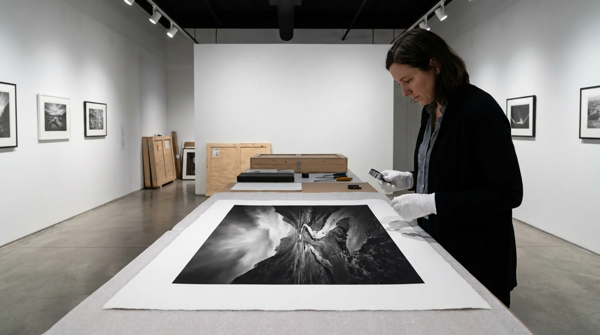
- Gloves: ALWAYS use white cotton gloves. The acid and oil from your fingers eat directly into the coating and leave irreparable yellow spots after years. Never touch the image area.
- Framing: Use acid-free cardboard and tape for mounting. Cheap tape or cardboard becomes yellow and acidic after years and chemically attacks the artwork (“Foxing”).
- Glass: Consider museum glass (anti-reflective and 99% UV-resistant) for the ultimate experience. It looks as if there’s no glass in front, and it protects your work.
Business Fundamentals: Valuation
A “work of art” is more than the sum of its parts (ink + paper).
- Exclusivity: Number your prints (Limited Edition). Scarcity creates value. An edition of 10 is worth more than “Open Edition”.
- Certificate: Provide a Certificate of Authenticity (COA) upon sale. Specify:
- Title and Artist.
- Date of printing.
- Printer: “Printed on HP DesignJet Z9+ with HP Vivid Photo Inks”.
- Paper: “Hahnemühle Photo Rag 308gsm”.
- Life expectancy.
- This document gives the buyer/collector the confidence that they are buying something durable and professional.
Conclusion: Craftsmanship
Printing is a craft, a “métier”. It is the final, crucial creative step of the photographer. Don’t outsource this thoughtlessly to a cheap online printer, but maintain control over your art. With the right tools, knowledge, and materials, you create prints that have as much emotional impact as the moment you pressed the shutter.
At Europlan, we have all the materials in-house to support this workflow, and we are happy to provide advice.
See also
- Strategic Purchasing Policy: How Europlan Acts as a Partner instead of a Supplier
- Color Consistency Across Multiple Locations: The Power of Shared ICC Profiles on HP Z-series
- Product/Solution: discover solutions for graphic arts
Discover our range of Fine Art media and printers, or book a demo