
Summary: The Business Case in Short
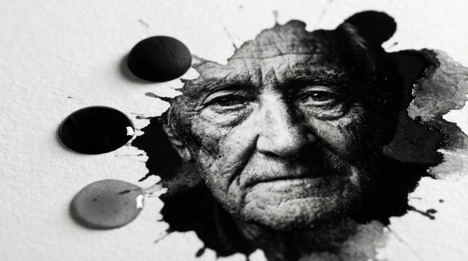
“Black and white is more colorful than color,” the famous photographer Elliott Erwitt once said. However, printing a good black and white photo (Fine Art Monochrome) is technically much more difficult than a standard color photo. The problem many photographers, artists, and print shops face is the dreaded “color cast”. A black and white portrait should not turn greenish (like moss), bluish (cool), or pinkish (magenta) in the midtones. This frequently happens when standard printers try to mix gray from their basic colors (CMYK). The HP DesignJet Z9+ and Z6 solve this fundamental problem by using a special set of dedicated gray inks and a deep Matte Black. The result: strictly neutral gray, deep contrast, and preservation of detail in the shadows, essential for selling high-quality art photos to collectors.
Technical Depth: Why is gray so difficult?
You might instinctively think: gray is just “less black”. Why do I need colors? If you only use black ink on white paper, you get a very “hard” image with little nuance (dithering). You literally see the space between the black dots. To create soft, fluffy transitions (gradients) in a cloudy sky or a soft skin tone, the printer must simulate light gray tones. Standard printers (which only have Black, Cyan, Magenta, and Yellow) do this by mixing the three colors.
- The Theory: Cyan + Magenta + Yellow = Neutral Gray/Black.
- The Practice (Metamerism): The balance is hyper-sensitive. If one of the three printheads gives just a little more ink (e.g., due to a temperature fluctuation of 2 degrees), or if you view the print under different light (fluorescent vs. daylight), the balance shifts.
- The Phenomenon: Your beautiful black and white photo suddenly looks green under the lamp in the living room. This is unacceptable for a fine art print that should cost € 500.
The Solution: Dedicated Gray Inks
The HP DesignJet Z-series uses a special, extensive ink set specifically designed for photographers and the “Giclée” market:
- Matte Black (MK): An ink specifically developed for matte, absorbent paper (such as Cotton Rag or Canvas). It does not penetrate deep into the fiber (which would make it dull), but stays on the surface for an extremely high optical density (D-max). Black is really a black hole, not dark gray.
- Photo Black (PK): For deep black on glossy paper (Gloss/Satin/Baryta). This ink is formulated to sit on the coating without becoming dull.
- Gray (G): A neutral, light gray ink.
The Advantage of Gray
By using this gray ink, the printer does not have to (or hardly has to) mix with Cyan/Magenta/Yellow to create the light areas.
- Stable Neutrality: Gray is really gray. Under any light, at any time. The color cast is physically eliminated because no color ink is used.
- Soft Transitions: The transitions from light to dark are buttery smooth, without “banding” (visible stripes) or “posterization” (sudden jumps in tone, often visible in skies).
- Shadow Detail: Where other printers “clog up” in the dark areas (you only see a black spot), the Z9+ preserves detail in the shadows. You still see the texture of the fabric in a black suit, or the drawing in the shadow of a tree. This makes the image lively and three-dimensional.
HP Pixel Control: The software magic
Hardware is one thing, control is the second. HP uses the revolutionary Pixel Control technology (developed in Barcelona). In traditional prints, colors are built up from layers of dots (Halftoning). Pixel Control determines exactly which ink combination is needed for each pixel in your file. For black and white, this means you have full, artistic control in the software (or driver):
- Neutral Gray: The driver forces the printer to use as much Black and Gray as possible.
- Cool Tone: The printer mixes in a fraction of Cyan for a chilly, modern, bluish look (like classic selenium toning in the darkroom).
- Warm Tone: The printer mixes in a fraction of Magenta/Yellow for a warm, sepia-like look (carbon print).
- Custom: You can determine the curve yourself. This happens in a controlled and consistent manner, every time.
Business Fundamentals: The market for Fine Art
Why is this commercially interesting for a photographer, framer, or print service?
1. High Marges (Value based pricing)
A poster is a “commodity” with low margins. A Fine Art black and white print is a “work of art”.
- Material cost: Paper (Hahnemühle) + Ink for an A0 print: approx. € 15 - € 25.
- Selling price: A numbered Fine Art print at this level is sold for prices between € 100 and € 500 (or much more if it concerns famous artists).
- The margin is gigantic, but only if the quality is perfect and uncompromising. One imperfection (such as banding or a color cast) and the value drops immediately to zero.
2. Archievability (Longevity)
The HP Vivid Photo Inks are pigment-based. Unlike dye inks (colorant, as in many cheaper printers), they do not fade under the influence of UV or ozone.
- HP guarantees, in combination with certified paper, a lifespan of more than 200 years behind glass, without visible discoloration (Display Permanence).
- This certificate (from the independent Wilhelm Imaging Research) is a powerful selling point to collectors and museums: “This is an investment for generations, not a temporary poster.”
3. Niche Markets
There is a growing demand for high-quality prints of:
- Historical archives: Cities and municipalities digitalizing old black and white photos and selling them to citizens.
- Wedding photography: Black and white is timeless and emotional. Couples are happy to pay extra for a large, framed black and white print.
- Interior decoration: Black and white fits into any interior, from modern to classic, and does not clash with the furniture.
Media & Supplies: The Canvas
The choice of paper is 50% of the result.
- Hahnemühle & Canson: The Z9+ supports well-known Fine Art paper brands via presets. You don’t have to guess with settings.
- Baryta Paper: This is the holy grail for black and white. It imitates the classic baryta paper from the darkroom. It has a slight gloss, a deep black point, and a fibrous structure.
- Matte Litho-realistic: A cheaper alternative for matte prints, with the look and feel of heavy drawing paper.
Conclusion: Emotion in ink
Black and white photography is about emotion, light, form, and texture. A bad print distracts from that emotion. A perfect print reinforces it. With the HP Z-series, you have the tools in hand to faithfully put the photographer’s vision (or your own) on paper, exactly as intended, without technical limitations.
Do you want to test and compare the depth of your black and white work with your current prints?
Read also
- The Pantone-problem Solved: How the HP DesignJet Z9+ hits 98% of your brand colors
- Productivity Without Interruption: Preventing paper jams and optimal plotter care
- Product/Solution: view our CAD plotters
Schedule a 1-on-1 print session in our demo room and experience the difference