
Summary: The Business Case in Short
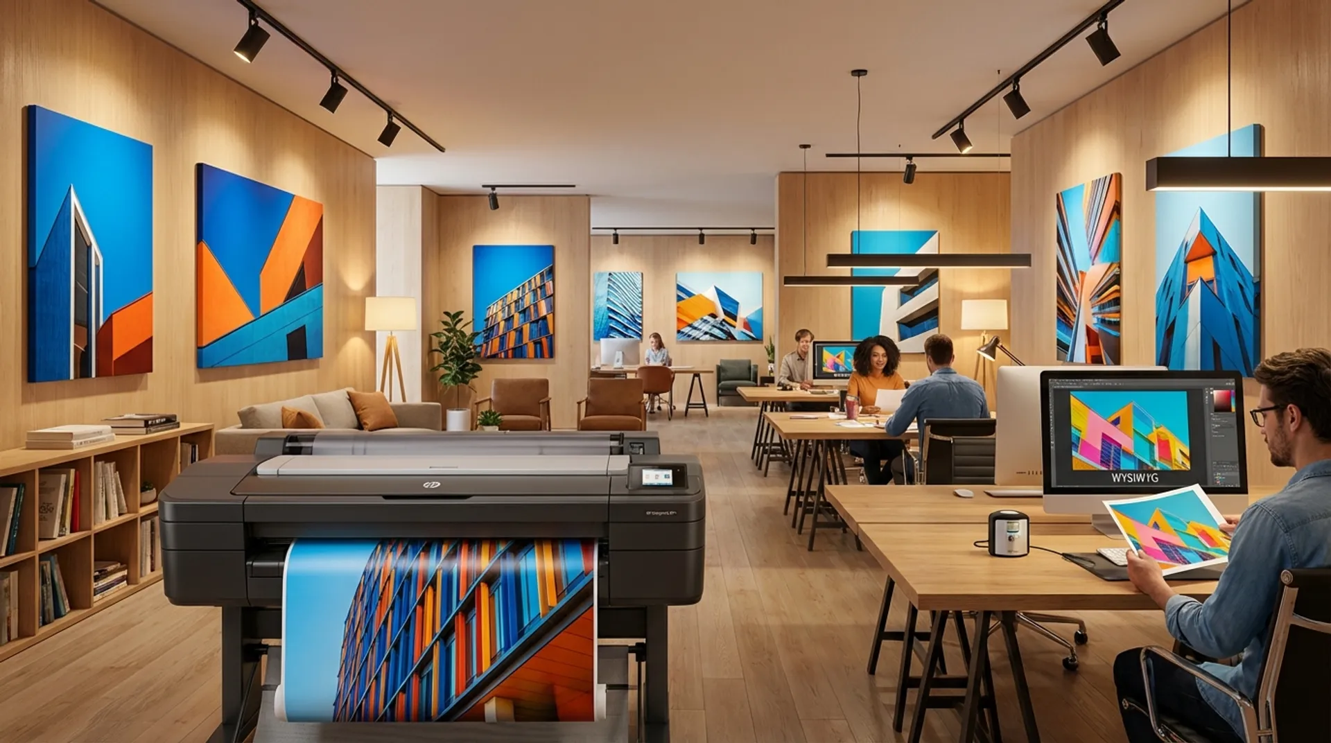
It’s the biggest frustration of every graphic designer and photographer: You’ve worked for hours on a poster. The red pops off the screen. The blue is deep and saturated. You press print. The result is… disappointing. The red is brownish, the blue is purplish, and the photo is too dark. The client rejects the proof. You have to start over (including “guesswork” color corrections). This costs ink, paper, and time. The cause is the fundamental difference between Light (Screen) and Ink (Paper). With the right ICC profiles and calibration, you can achieve “What You See Is What You Get” (WYSIWYG) and print it “First Time Right”.
The Theory: RGB (Light) vs. CMYK (Pigment)
Here’s where it goes wrong:
- Your Monitor (RGB): Works with light (Red, Green, Blue). If you turn on all the lights, you get White. A screen can create incredibly bright, neon-like colors (large color gamut).
- The Printer (CMYK): Works with ink (Cyan, Magenta, Yellow, Key/Black). If you mix all the ink, you get Black (or dark brown). Paper reflects light; it does not emit light.
- The Gap: Many bright RGB colors (like bright green or electric blue) are “Out of Gamut”. They simply don’t exist in the ink world. The printer tries to approximate them but fails, making them look dull.
The Solution: Color Management (ICC)
To translate between these two worlds, you need an interpreter: The ICC profile.
1. The Paper Profile
Every paper reacts differently to ink.
- Glossy paper: Ink sits on top -> Large color space, deep black.
- Matte paper: Ink absorbs into it -> Smaller color space, duller. The printer needs to know which paper you are using so it can adjust the ink delivery.
- Wrong: Printing on photo paper with the “Plain Paper” setting. Result: Ink pools, colors are incorrect.
- Right: Download the specific ICC profile from the manufacturer (e.g., HP or Hahnemühle) and install it. Or select exactly the right paper type in the driver.
2. Calibration (The Spectrophotometer)
Modern graphic printers (like the HP DesignJet Z9+) have a built-in eye: the Spectrophotometer (i1).
- The printer prints a test chart with color patches.
- The eye measures the actual color that appears on the paper.
- The printer compares this with what it should be.
- It automatically creates a correction profile.
- This guarantees that your Z9+ prints exactly the same today as it will in 6 months, even if the humidity is different.
Business Fundamentals: Proofing
In the advertising world, color is sacred. Coca-Cola red must be Coca-Cola red.
- If you calibrate your plotter properly, you can use it as a Proofer (Contract Proof).
- You can show the client: “This is exactly how the commercial printer will print it later in a run of 10,000.”
- This prevents discussions and claims afterwards with the commercial printer.
Europlan Service: Color Consultancy
Color management is complex.
- We visit you with professional measurement equipment.
- We calibrate your monitors (so they show the truth).
- We profile your printer for your specific paper types.
- We train you in Photoshop/InDesign settings (“Let printer determine colors” vs “Let Photoshop determine colors”).
Conclusion: Stop Guessing
Printing colors “by eye” is amateurism. Color management is mathematics. With the right tools and settings, printing becomes predictable and fun.
Would you like to have your color workflow checked?