
Summary: The Business Case in Short
For a graphic designer, advertising agency, print operator, or brand manager in retail, there is nothing worse than a print that just doesn’t match the corporate identity. The iconic Coca-Cola red, the specific Starbucks green, or the Proximus purple… brand colors are sacred. They define identity.
Yet many large-format printers struggle to reproduce these specific “spot colors” (PMS), especially in the difficult orange, red, and violet spectrum. In practice, a deviation often means: rejection by the customer, reprinting, wasting expensive media, and a dent in your reputation as a print supplier.
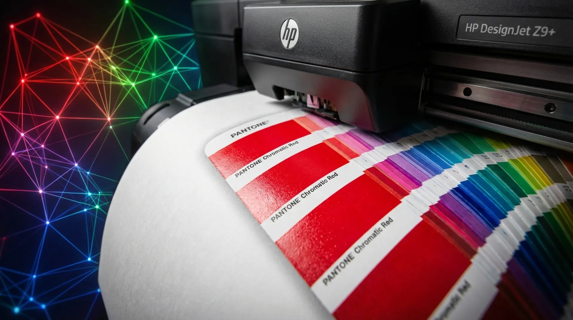
The HP DesignJet Z9+ promises to solve this with a coverage of up to 98% of the Pantone Coated gamut. How do they do it? And how can they do it with fewer ink cartridges than the competition? The secret lies in the revolutionary “Chromatic” ink technology and the built-in spectrophotometer. In this blog, we dive deep into color science.
The Frustration of the Gamut Warning
If you work professionally in Adobe InDesign, Illustrator, or Photoshop, you know it well: you choose a specific Pantone color from the library, and a small warning triangle appears in the color picker: “Out of Gamut”.
The software is actually warning you: “Watch out! The color you see on your (hopefully calibrated) high-end monitor is too bright, too saturated, or too deep for the printer to physically reproduce with its ink set.”
The CMYK Limit
Traditional large-format printers use CMYK (Cyan, Magenta, Yellow, Black) as a base.
- With CMYK, the color range (the “gamut”) is physically limited. It is a hexagon within the horseshoe of visible colors.
- You simply cannot mix certain colors. Bright orange, deep violet, neon green, or reflex blue often fall outside the possibilities.
- The result on paper is disappointing: what was supposed to be a “pop color” is printed dull, muddy, or flat.
The Old Solution: Is More Better?
In the past, the solution from printer manufacturers was to add more ink colors. Cartridges for Orange, Green, Violet, Blue, Red, Gray, Light Gray… Some printers had up to 12 different ink colors on board.
- Disadvantage: Expensive to purchase (stocking 12 cartridges), complex management, and the printheads clog faster if a certain “exotic” color (e.g., green) isn’t used in your prints for months.
The Solution: HP Pixel Control & Chromatic Red
The HP DesignJet Z9+ takes a fundamentally different approach. HP has revised the traditional ink set and its control.
1. HP Vivid Photo Inks with Chromatic Red
HP has added a special red ink (“Chromatic Red”) to the basic set. Why red specifically?
- Because the human eye is extremely sensitive to red tones (evolutionary determined).
- Because many commercial logos use red and orange to attract attention and stimulate appetite.
- With this single addition, the gamut in the red-orange-yellow spectrum is expanded enormously. You can now print colors that were previously impossible with 9 inks.
- Depth: Because of the extra contrasts possible, images get more “pop” and a 3D effect.
2. HP Pixel Control: The New Math Behind the Droplet
This is the real revolution under the hood. Instead of the old way of “halftoning” (where dots of different basic colors are placed next to each other to simulate a mixed color for the eye), the Z9+ controller calculates the exact color mix at the pixel level.
- The printer “knows” directly which combination of inks (e.g., 2 drops of Chromatic Red, 1 drop of Yellow, 1 drop of Gloss Enhancer) is needed for that specific pixel.
- This results in much smoother transitions (gradients) without “banding” or visible dots (“grain”), even at lower resolutions and higher speeds.
3. Optional Gloss Enhancer (GE)
A well-known problem with pigment inks on glossy paper is “bronzing”. In dark areas (where there is a lot of ink), you see a metallic, brownish sheen that differs from the white (paper) parts when you hold the print at an angle. The Z9+ uses a special Gloss Enhancer fluid. It applies a microscopic layer over the entire print (or only the printed parts), so that the reflection is uniform across the entire surface. The result looks like a traditional chemical photo from a lab.
Spectrophotometer: The Built-in Color Master
Color is not stable. Humidity, temperature, paper type, and printhead wear affect the tint. What is perfectly blue today might be purplish tomorrow due to a change in humidity.
- The Z9+ has a built-in X-Rite i1 spectrophotometer in the printhead carriage.
- This is an accurate robotic eye that measures exactly which colors are actually landing on the paper.
Automation of ICC Profiles (Self-sufficiency)
In the past, you had to hire an external consultant to “profile” your printer with a separate measuring device. That costed € 500 per paper type and took half a day. Now you do it yourself in 20 minutes:
- You load a new canvas, photo paper, or banner material.
- You choose “Calibrate & Profile” in the touchscreen menu.
- The printer prints a test chart with hundreds of color patches.
- The printer dries the ink with its internal heating element.
- The spectrophotometer scans the patches, measures the deviation, and generates a perfect, custom ICC profile.
- This profile is stored in the printer and synchronized with your driver. Result: You are independent, save money, and your colors are always right.
Business Fundamentals: Where is the Profit?
For a sign company, print studio, or repro house, color is not art, but hard business.
1. Fewer “Reject” Prints (Scrap Rate Reduction)
How often do you have to reprint a poster because the customer says upon pickup: “That’s not my blue”?
- Every failed proof costs ink and expensive media.
- But above all: it costs the time of your operator and prepress designer (applying color correction, re-ripping).
- With the Z9+, you eliminate the guesswork. “What you see is what you get”.
- ROI: Suppose you currently throw away 10% of your prints (or give a discount). With the Z9+, this drops to < 1%. On an annual turnover of € 50,000 in large format, that is € 4,500 direct profit.
2. Faster Approval (Time-to-Market)
If you can prove to a demanding client (e.g., a museum, luxury brand, or fashion house): “This is Pantone 485C with a Delta-E deviation of < 2.0”, the discussion about taste stops. You deliver quality according to objective standards. You become the preferred supplier for customers who demand quality and are willing to pay for it.
3. Ink Efficiency
Despite the high quality, the Z9+ is efficient. HP’s Pixel Control and High Definition Nozzle Architecture (HDNA) ensure that less ink is needed per m² to achieve the same optical density than with older technologies. You print more meters with the same cartridge.
Media & Supplies: The Foundation
Color management starts with the paper. The printer cannot perform miracles on cheap newsprint. The coating determines the color gamut.
- HP Artist Matte Canvas: For art reproductions. The Z9+ prints effortlessly on canvas that can later be stretched without “cracking”.
- HP Premium Instant-dry Satin Photo Paper (260 g/m²): The industry standard for high-end posters and photography.
- Fine Art Papers: The printer also supports Hahnemühle, Canson, and Tecco via presets.
- Europlan provides the corresponding base ICC profiles, so the printer knows exactly how the ink reacts to this specific top layer (ink limits, drying time).
Conclusion: Color is Trust
Your customers trust you with their brand. That brand is often worth millions. With the HP DesignJet Z9+, you don’t damage that trust. You deliver consistent, vivid, and accurate colors, print after print, month after month.
Do you want to test your most difficult corporate identity color? Send us your file.